Designing a personal website
I’ve been working on a personal website on the side for some time and I’m glad to finally get things working the way I want.
I initially started this last November & iterated over design a couple times since then. I chose Webflow & started learning how to use it from videos on their website. Webflow provides for all base functionalities and then there’s forum support + some extra geekiness for added customizations. Overall things work so well & as expected.
Design Process
As I started using Substack to run a newsletter in parallel, I was searching for ways to redirect between both sites without feeling out of home. I also didn't want to copy-paste newsletter issues' text to Webflow. I want to keep posts on each of them separate & mutually exclusive when it comes to content, with only title references & links shared between both. The only obstacle was the design, and thankfully Substack simple customization settings filled in this gap.
Minor things that helped:
Changing body page background & font colors on Substack to match Webflow
Integrating Substack "Subscribe HTML Embeds" for desktop & mobile views
Consistency with logos, favicons, visuals
Adding second titles for all posts
I will mainly be posting 3 types of posts: blog, newsletter & book highlights:
Blog: Short-form & long-form articles about things I am/was interested in.
Newsletter: A weekly blend of interesting ideas + different resources & stories that happen to be interesting.
Book Highlights: A summary of a book I read in bullet points.
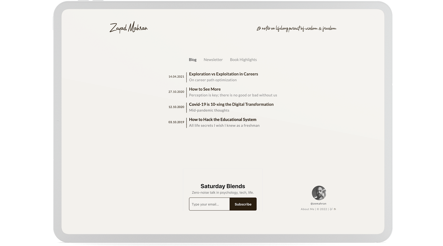
My goal was to reduce travel time between different post titles for anyone who just came onto the website. I was initially keeping a page for every type, now it's a tab container that switches between all three without page reloads.
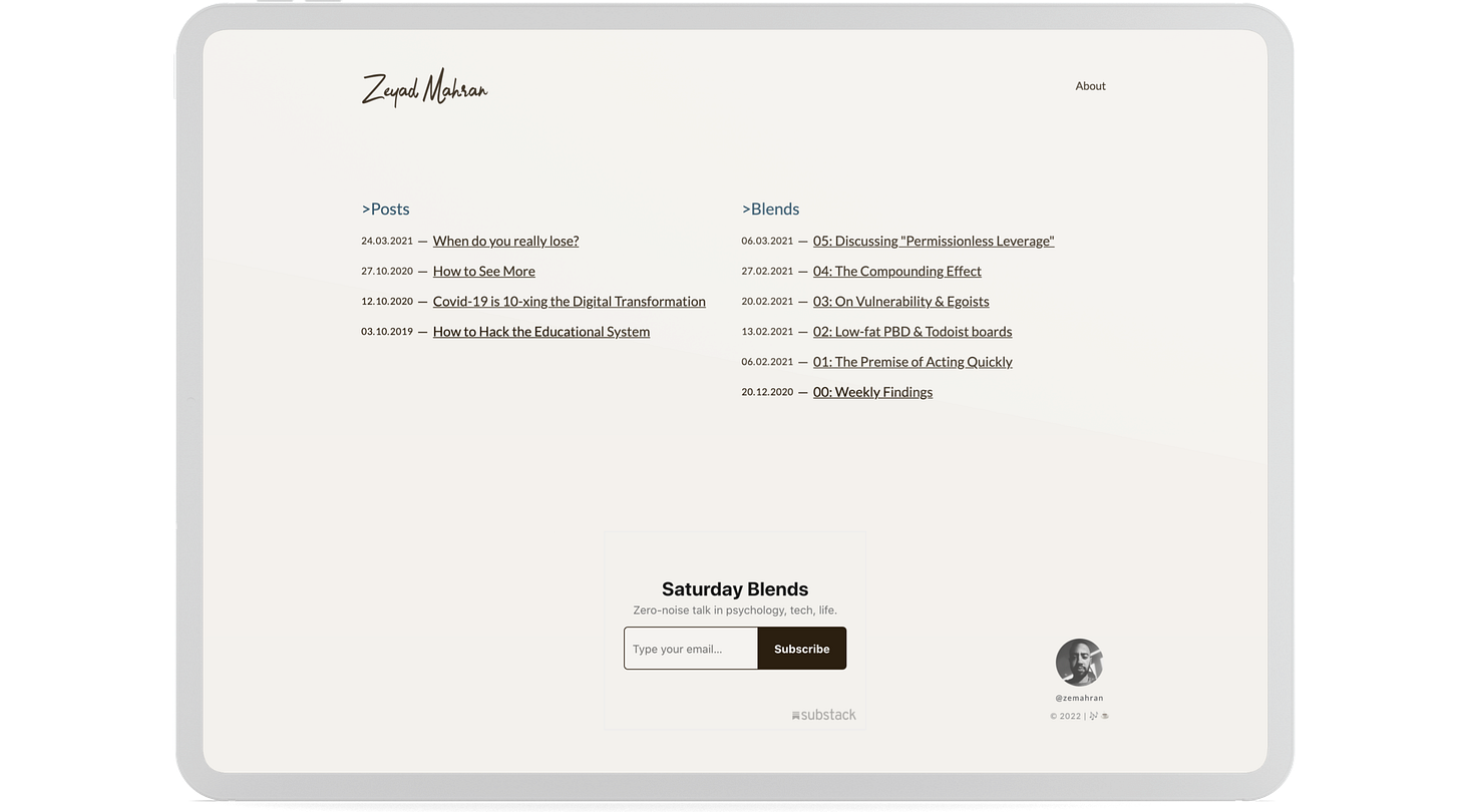
Design iterations:
I was also heavily inspired by the Substack editor page theme while designing the template post page on Webflow. Which helped make things similar to a certain degree.
I am keeping track of the cumulative time I take to make, edit, learn or tweak things and it approximately hit the 50 hours mark as of recently. It's been fun.
I am not a web designer but I used to have love for design, made lots of interfaces as an undergrad. The only true thing I know about design is that there's always room for improvement no matter what. So a great framework I found good is: Every once in a while you can pick the worst/least efficient part in your interface and work on improving it, without wasting time obsessing over minute details. Or as some like to put it “Don't fantasize over font size”.
I am now in the process of bringing over older content/writings I have scattered over notes apps. This should be interesting nevertheless.
Any feedback regarding any of the above is definitely appreciated.
If you’ve enjoyed this post, make sure to share it & spread the word.
I want to be able to deliver a valuable newsletter to all of you, so I’d love to hear your thoughts. You can reply directly to this email or let’s catch up on twitter.


